Mary Kate Larson
Harbor Pilates
CASE STUDY · BRAND IDENTITY · VISUAL DESIGN · 2026
ROLE
DELIVERABLES
TOOLS
Graphic Designer
Brand Identity · Print · Social
Adobe Illustrator · Photoshop
— OVERVIEW
Harbor Pilates sits at the intersection of athletic performance and mindful movement, not the soft pastel world of traditional wellness, and not the aggressive intensity of fitness brands. It needed a visual identity that felt warm and grounded without feeling soft.
A brand that didn't want to look like a studio.

Young professionals know they should be thinking about money but feel so overwhelmed by existing tools that they do nothing instead. The opportunity is reducing the activation energy for financial decision-making, not simplifying the finances, but simplifying the experience of engaging with them.
— PROBLEM STATEMENT
— RESEARCH & POSITIONING
Finding the white space in a crowded market.
I audited 8 Boston-area pilates and boutique fitness studios. The landscape split cleanly: soft wellness (blush pinks, thin serifs, vague copy) and aggressive performance (black, bold condensed type). Harbor had an opportunity in neither camp. I looked outside fitness entirely, coastal architecture, nautical charts, artisan goods. The name "Harbor" became the conceptual anchor: strength, calm, shelter, intention.
THE MARKET LANDSCAPE
THE POSITIONING I TARGETED
Soft wellness: blush, thin serifs, vague copy
Performance: black + red, aggressive, intimidating
Neither spoke to a sophisticated coastal audience
Most logos: wordmarks only, no visual system
Warm + grounded sage green and warm neutrals
Structured, confident, not soft, not aggressive
Editorial craft for a design-literate audience
A full system: logo, type, color, print, social
—VISUAL IDENITITY: COLOR PALETTE
Warm, grounded, unexpected in pilates.
Sage green as the primary brand color is calm and confident, distinct from the blush-and-white wellness category. Paired with warm taupe, off-white, and deep earth tones.
Harbor Sage
Warm Taupe
#4E7B6A
Off-white
Dark Earth
Sand
Secondary
#F2EDE4
Background
Type
Primary
Accent
#ADA598
#2C2416
#BFA07A
—DELIVERABLE 01 : PROMOTIONAL FLYER
The brand's first public face.
Designed for digital and print distribution. The flyer introduces the logo, brand photography, key messaging, and a clear call-to-action are all the visual elements working together for the first time.

Promotional flyer — "Pilates that feel good" · print + digital
— DELIVERABLE 02: TRIFOLD BROCHURE
Services, pricing, and story in print.
A three-panel brochure for in-studio distribution. Covers services, pricing, team, and contact. Printed on off-white uncoated stock to reinforce the warm, tactile brand feeling.
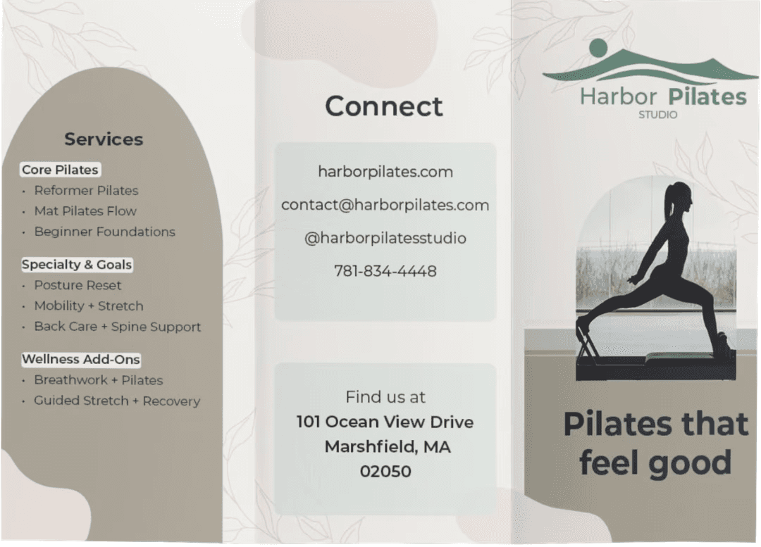
FRONT COVER & SERVICES

INTERIOR - ABOUT & PRICING
— DELIVERABLE 03 — SOCIAL MEDIA CAMPAIGN
The brand on Instagram.
Campaign posts designed for Instagram, the visual system translates cleanly from print to digital while maintaining the sage green palette and bold headline style.

Instagram campaign — "Feel better in your body starting this week" · 2 weeks unlimited for $49
— DESIGN PROCESS
How it came together.
01
02
03
04
Competitive audit: 8 studios
Print & digital application
Brand positioning & concept
Logo system & type pairing
The Harbor concept: coastal materials, nautical charts, artisan goods. Strength, calm, shelter. Every visual decision flows from this conceptual anchor.
Mapped the visual landscape of Boston-area pilates and boutique fitness. Identified the gap between soft wellness and aggressive performance, and designed into it.
Primary lockup in three variants, light, dark, brand-color. Paired with an editorial serif and a clean geometric sans for maximum flexibility across touchpoints.
Applied the system across promotional flyer, trifold brochure, and Instagram campaign. Each touchpoint tested the system for consistency and resilience.
— OUTCOMES
What this demonstrates
4
3
8
Deliverables: flyer, brochure (×2), social
Logo variants in full system
Competitors audited before designing
Brand identity pushed me to think at a different scale, not "what does the user do next?" but "what does this organisation feel like across every touchpoint, over years?" A brand system has to be resilient to misuse, not just optimal in ideal conditions.
For UX and product roles: Harbor Pilates demonstrates the visual craft foundation I bring to interface work. Typographic sensitivity, colour judgment, system thinking. A well-designed UI is just a well-designed brand applied to screens.
What brand work taught me that UX doesn't.
Mary Kate Larson
© 2025 Mary Kate Larson · Boston, MA