Mary Kate Larson

FutureFunds
CASE STUDY · WEB APP · UX/UI DESIGN · 2025
ROLE
PLATFORM
DOMAIN
TOOLS
Solo UX/UI Designer
Web · Desktop + Mobile
Fintech · Financial Planning
Figma · Adobe CC

— OVERVIEW
— EXPLORE THE PRODUCT
Most financial tools are built for people who already have money and already understand it. Dense, jargon-heavy, assuming the user knows what a Roth IRA is. Future Funds is designed for the first-jobber: 22–28, first real salary, not sure what to do first. The design challenge wasn't adding features, it was removing complexity until the right next step was obvious.
Financial planning designed for people who've never planned.
Young professionals know they should be thinking about money but feel so overwhelmed by existing tools that they do nothing instead. The opportunity is reducing the activation energy for financial decision-making, not simplifying the finances, but simplifying the experience of engaging with them.
— PROBLEM STATEMENT

— RESEARCH & DISCOVERY
The real competitor isn't Mint. It's paralysis.
I audited four major fintech products: Mint, YNAB, Robinhood, and Betterment, through the eyes of a first-time user with no financial background. Each had the same failure: onboarding immediately asked questions the target user couldn't confidently answer. The cognitive cost felt higher than the reward of finishing setup. Users quit before they started.
WHAT EXISTING APPS GOT WRONG
DESIGN PRINCIPLES I COMMITTED TO
Jargon-heavy onboarding assumes prior literacy
Overwhelming dashboards show everything at once
No guidance on what to do first just data display
Forced account linking creates immediate friction
Visual design signals "complex finance," not warmth
One clear next action per screen
Plain language throughout, no unexplained jargon
Progressive disclosure: start simple, reveal depth slowly
Onboarding asks what you know, not what you have
Optional account linking, value before trust




Hero: Designed for clarity A clean visual hierarchy and generous spacing immediately communicate the platform's purpose while keeping the primary actions front and center.
Service Offerings: Simplifying complex information
I grouped financial services into digestible sections with icons and concise descriptions to improve scanability and reduce cognitive load.
Calculator: Reducing decision anxiety - The calculator uses progressive disclosure and familiar form patterns to make retirement planning feel approachable rather than overwhelming.

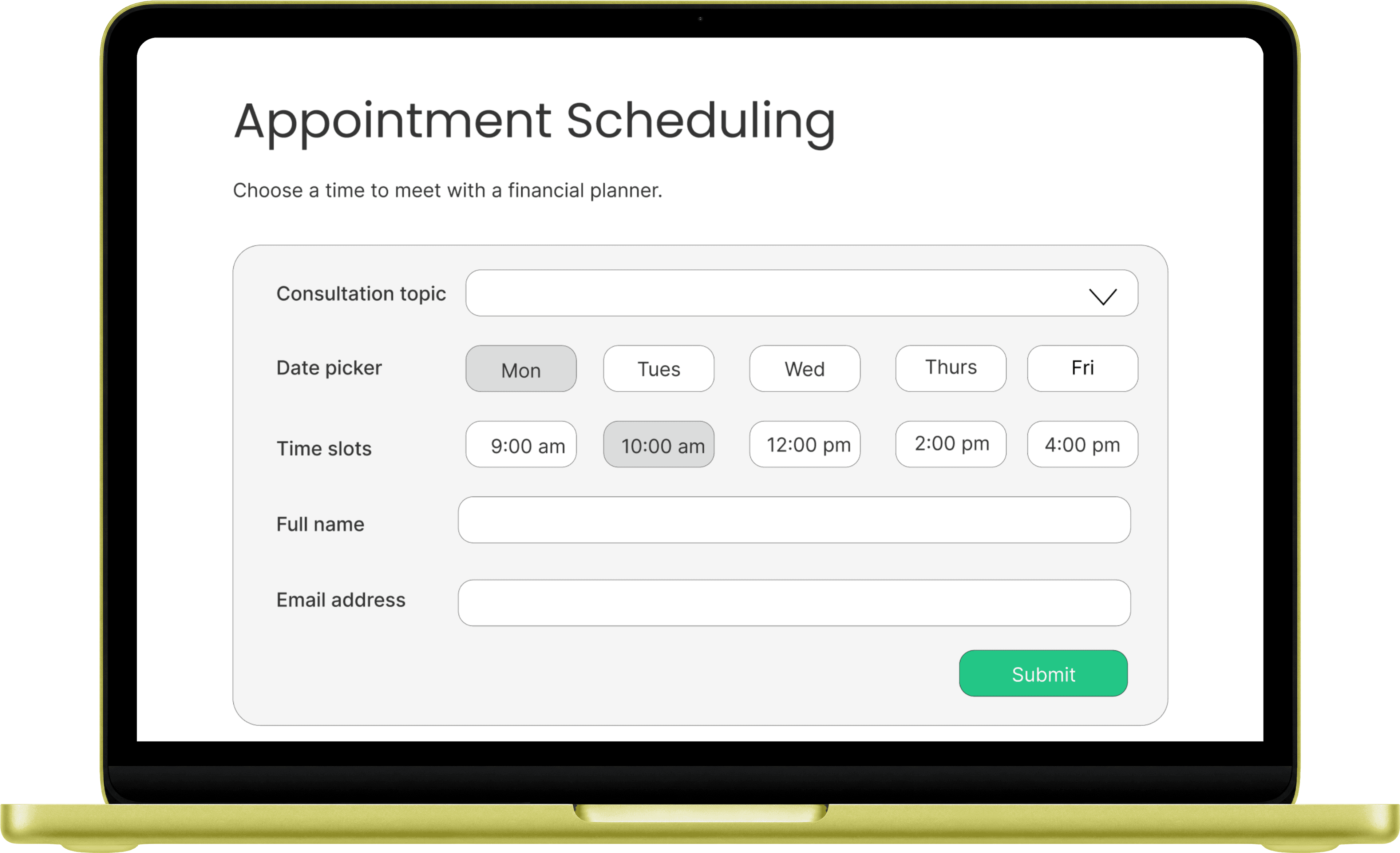
Appointment Scheduler: Creating an effortless booking flow - I prioritized clear form fields, logical grouping, and minimal friction to help users schedule consultations quickly.
Blog: Supporting financial education - Educational content was integrated directly into the experience to encourage continued learning and build long-term user trust.
Testimonials: Building credibility - Social proof and measurable impact statistics reinforce trust while balancing the informational content elsewhere on the page.
— DESIGN PROCESS
Structure before screens
01
02
03
04
User persona — Jess, 24
High-fidelity UI system
Information architecture
Desktop + mobile wireframes simultaneously
Key structural decision: separating "what do I have" from "what should I do next" into two distinct paths. Most fintech apps conflate these, creating decision paralysis.
First job at $52k, has a 401k she's never logged into, $3k in a checking account doing nothing. Every design decision ran through: would Jess understand this immediately?
The target user's relationship with finances differs by device, mobile for quick checks, desktop for actual decisions. The layouts reflect that intentionally.
Navy and warm white, rounded components, clear typographic hierarchy. The system signals "serious but not scary." Optional account linking removes the biggest activation barrier.
— KEY DESIGN DECISIONS
Simplicity as a deliberate choice, not a limitation.
Decision 1 — The "One Thing" dashboard. One recommended action for this week, a savings snapshot, one goal progress bar. Everything else is one tap away. I removed two planned modules after feedback showed they were adding noise without value.
Decision 2 — Jargon-free copy system. "Emergency fund" replaces "liquidity buffer." Every piece of microcopy audited against a 7th-grade reading level. This is a UX decision as much as a writing one.
Decision 3 — Optional account linking. Unlike Mint or YNAB, linking accounts is optional. Users can manually enter balances and get value from the app before trusting it with banking credentials.
— OUTCOMES
What this demonstrates
2
4
1
Platforms · Desktop + Mobile
Competitors audited in depth
Clear persona driving every decision
This design is concept-stage and it hasn't been tested with real users who carry real financial anxiety. That's the critical gap. My next step would be moderated usability sessions with 5 people matching the Jess persona: does onboarding feel approachable? Does the dashboard build confidence or create new anxiety?
— REFLECTION
What I would do differently
Mary Kate Larson
© 2025 Mary Kate Larson · Boston, MA