Mary Kate Larson
CleanMind
CASE STUDY · IOS APP · UX/UI DESIGN · 2025
ROLE
TIMELINE
TOOLS
PLATFORM
Solo UX/UI Designer
3 months · Sep–Dec 2025
Figma · FigJam
iOS · Mobile-first
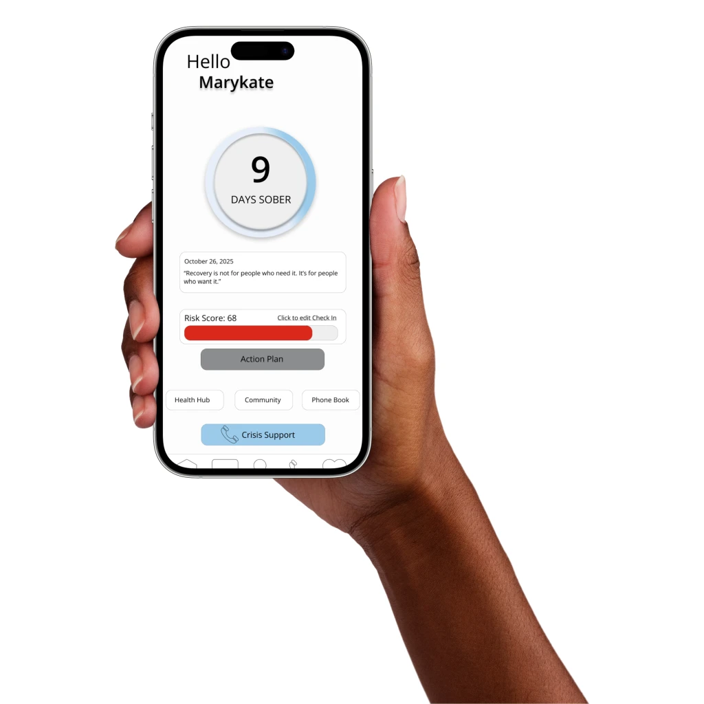
Designed CleanMind's core system, a milestone model and real-time risk score, from one research finding: streak mechanics are the recovery-app category's biggest motivator and its biggest churn driver.
— OVERVIEW


Home/Dashboard: Days sober, risk score, one-tap action.
Risk Score: Breaks down what's driving today's score.
Action Plan: Six concrete actions when risk is high.
Check-In: Daily log that feeds the risk score.
Community: Peer stories, filtered by program or location.
Phone Book: Sponsor contacts, one tap away.
Resources: Searchable treatment centers by care type.
Treatment Centers: Ratings and reviews for each center.
Health Hub: Appointments, meds, and therapist notes.
Problem →
Constraint →
Competitive research →
People in early recovery need support in the moment a craving hits. Existing apps only log what happened after.
No access to real users with lived experience; problem definition built from competitive research, not interviews.
Audited 5 recovery apps. Same gap in all of them: streak mechanics reset to zero on relapse, turning the core motivator into the core churn driver.
— RESEARCH & DISCOVERY
Competitive analysis
APP
STREAK / PROCESS MODEL
GUIDANCE AFTER CHECK-IN
I Am Sober
Sober Grid
Nomo
Bearable
Headspace
Resets to zero on relapse
Resets to zero on relapse
Resets to zero on relapse
None — logs mood only
Clinical
Clinical
Clinical
Community feed, no direct action
Social
None — counter only
No streak — general mood log
None — passive tracking only
No streak — session count
Generic meditation suggestion
Calm, generic
Five recovery apps audited against the same three criteria, alongside published research on digital health interventions for substance use disorder.
CleanMind
Milestones accumulate, never reset
Specific Next Best Action from risk score
Warm, direct
Every app audited shared the same gap: a relapse punishes progress instead of informing it, and none translate a check-in
into an actual next step.
— DESIGN PROCESS
From research to a system that holds together.
01
02
03
04
Audited 5 recovery apps (I Am Sober, Sober Grid, Nomo, Bearable, Headspace) against published research on digital health interventions, and found the same gap in every one: streak mechanics reset to zero on relapse, turning the core motivator into the core churn driver.
Built the full design system, color, type, spacing, icons, before any high-fidelity screens, so every screen after was a system decision, not a one-off.
First dashboard draft had three competing actions on one screen. Peer feedback was immediate: “I don’t know where to start.” Rebuilt around one primary action per screen from there.
Designed the risk score to turn a daily check-in into a specific Next Best Action instead of a mood label, and chose amber over red for the gauge so an elevated reading feels serious without feeling alarming.
— OUTCOMES
What this project proves.
12 screens, 5 apps audited, 4 user flows, that’s the scope, not the impact, since this hasn’t been tested with real users yet. The one real signal I have: the peer feedback that rebuilt the dashboard, which is the only part of this that came from someone reacting to the work instead of research about the category. Next step is talking to 3 people in recovery about the craving-response flow specifically, the thing that would move this from research-informed to validated.
A companion for the moment cravings hit, not just the moments between meetings.