Team
Marykate Larson
Tools
Adobe InDesign & Illustrator
Timeline
24 hours; February 10-11,2023
Design Brief
This was a mock project that I created for a school assignment. The assignment instructed me to create an advisement that was targeted toward Millennials. The advertisement was engaging for the target audience because it took into account their behavior, emotions, and thinking. All of this was based on human-centered design.
Problem
The problem that I had to solve was to create an advertisement that was appealing to Millennials because he current advertisement was geared more toward the Boomer generation.
Goals
- Make an advertisement that was appealing to Millennials.
- To use human-centered thinking to solve the problem.
- Demonstrate ability to use a design process.
Research
Some characteristics and attributes that make up a Millennial are feeling special and sheltered this is important to show in an advertisement because it will appeal to them. Millennials are also very confident and team-oriented. They are high achieving, slightly pressured, and feel like they can’t get enough time during the day to complete what they want to do. Millennials are also very conventional meaning their parents’ opinions are very important to them.
Ideation
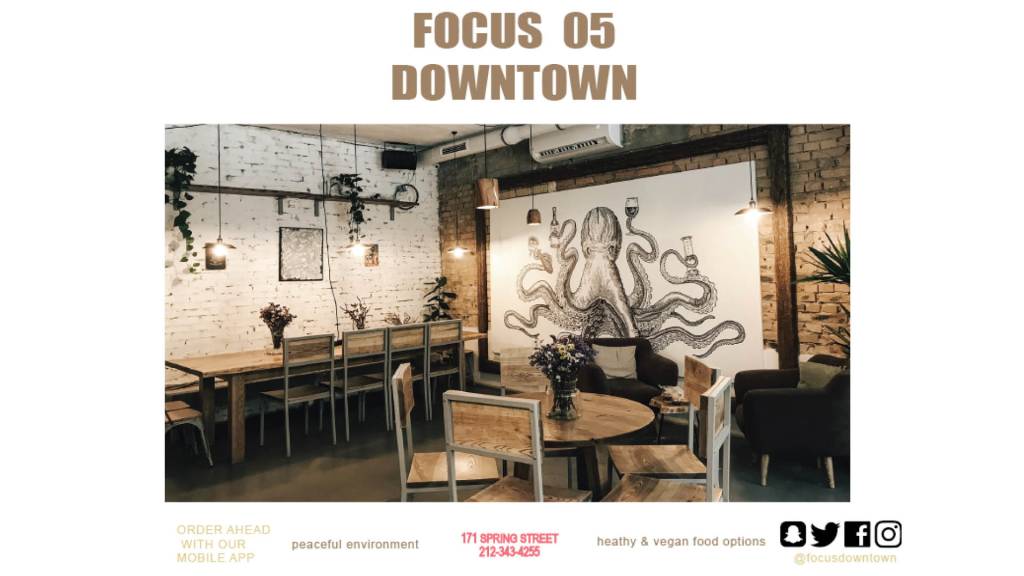
The problem that I am trying to solve is that the current ad for the restaurant doesn’t appeal to the target audience, Millennials. The current ad is more geared toward Baby Boomers. With a few changes I was able to adjust the advertisement to look more like something that would appeal to Millennials.
Define
The current ad didn’t have the right color scheme, it was all dark colors and Millennials prefer vibrant, fully saturated colors and earth tones. These colors create excitement and adventure. Also, the type that was chosen for the current advertisement was wrong. The type needed to be less wordy and smaller because it was secondary to the images. The layout was also wrong, there wasn’t enough white space and there is no typographic hierocracy.
Mind Map
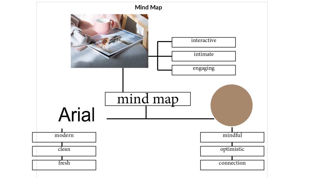
The components in my mind map represent the target audience because it specifically caters to every one of their needs. The font I chose is very modern, clean, and fresh which is everything that a millennial is looking for in a font for an advertisement. The image I chose is very interactive because it shows the mug sitting on the book intimate. It feels like you are sitting down for a cup of coffee with someone. I chose the color beige because it is calming to look at, mindful, optimistic, and shows a connection with each other.
Mood Board
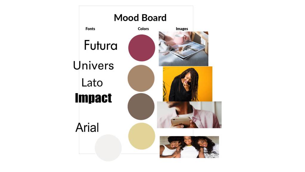
I made my mood board in a way that would fit the Millennial aesthetic. I chose fonts that were sans serif because Millennials are very specific when it comes to fonts. They want a font that is Contemporary, Fresh, Adventurous, Modern, Approachable, and Clean. I matched it thoughtfully with the color because it is one of the most emotional elements of design. I chose the muted colors pink, tan, brown, beige, and white to show a mindful vibe. The colors had a calming presence which I think will appeal to the stress-free vibe that the target audience is looking for. I chose images that were very specific to the target audience’s needs and also fit my color scheme. I wanted the pictures to feel unique while also engaging and interactive.
Reflection
Through this design challenge that was assigned to me, I developed my skills in Adobe Illustrator and human-centered design. I have never designed an advertisement before or learned about problem-solving with human-centered design so this was a challenge for me. I am really proud of the way that this project turned out and I received amazing feedback from my instructor and peers.
